The Urban Structure Comparison page is an app built in R Shiny that allows for the comparison of any pair of cities included in the sample (see full list below).
For each city, the app outputs four elements:
- Summary Table. The summary table shows the numbers used in national and global comparisons. It includes:
- Total population and the number of households: The sum of all individuals and households in the defined urban region.
- The average density and population weighted density: The average density is the mean of each geographic unit’s density. Population-weighted density weights each unit’s density by its population when averaging. This measures the density at which the average person lives, and will reflect that places where more people live in dense neighborhoods
- Median income as % of national median income: We calculate the national median income based on the best version of the data we have available (i.e. before we subset it to included regions). In all cases, the estimated median is nearly identical to that reported by the national statistics office. We then normalize the city’s median income by the national income to facilitate comparison within and between countries. This makes it easy to gauge which cities are wealthier or poorer than than the national average.
- Percent of the population in the city center: This is a measure of population concentration. The higher the percentage, the greater the concentration in the urban core. We define the center as all locations within five km of the principal city’s city hall. For example, this roughly corresponds to the city of Paris proper.
- Income segregation index: Segregation is measured with the ordinal entropy index. The index is a measure of evenness. It compares the distribution of households in each income category within sub-units to the entire city. The more the distribution across income categories resembles the city’s, the lower the index. Because different countries define small geographic units inconsistently, we aggregate them to sectors that are the same size for every city.
- Ratio of 80th to 20th percentile of income: This measure of income inequality has the advantage of not relying on the full income distribution (which we do not have data on). A ratio of two, for example, means that people in the top quintile of the income distribution have income double that of the people in the bottom quintile.
- Ratio of highest income sector to lowest: This measure works similarly to the 80/20 ratio but applies the logic to urban areas instead of the overall income distribution. It compares the area of the city with the highest median income to that with the lowest. The higher the ratio, the greater the inequality between urban areas.
- Polar Income Diagram. The polar diagram organizes the city into sectors to simplify the measure of the spatial distribution of income inequality and make comparison easier. We use the bearing and distance of every neighborhood’s center (i.e. location by distance and angle relative to the city center) to group neighborhoods into evenly defined sectors of five km by 10 degrees. This means that areas nearer the center are smaller and the furthest areas are the largest. Because the densest areas tend to be more central, the population size tends to be constant between units. The example below shows this diagram superimposed on a map of the Los Angeles region. In this example, the yellow sectors have the highest concentration of people with income below the city’s bottom quintile. Specifically, 30% of the population of yellow sectors have income below the lowest quintile. In contrast the darkest blue sectors have less than 10% of their population below the lowest quintile. This shows clearly that central Los Angeles and areas to the northeast are the lowest income.
![]()
The application has three options for displaying the polar income diagrams. Q1 highlights the distribution of households under the first quintile of income. The ‘very low’ category is for sectors where less than 10% of the population is under the first quintile. The ‘low’ category is where between 10 and 15% of the population is below that threshold, ‘medium’ is between 15 and 25%, and the high categories mirror the low. The Q4 option is the same as Q1 but for people above the top quintile of the income distribution. Finally, the Median option shows the median income of the sector relative to the regional median.
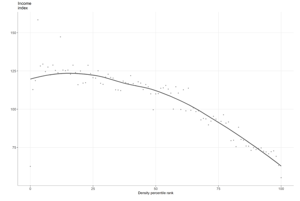
- Income over density. On the home page, we showed that the correlation between income and density varies widely across and between countries. We unpack these correlations to plot the relationship between density and income for each city. We rank every neighborhood by its density from least dense to densest. We then standardize the ranking to between 0 and 100 and group all neighborhoods by nearest percentile. For each percentile, we then estimate the median income. The dots are the median income at each percentile and the line the smoothed relationship of income and density. This produces the type of plot presented below.
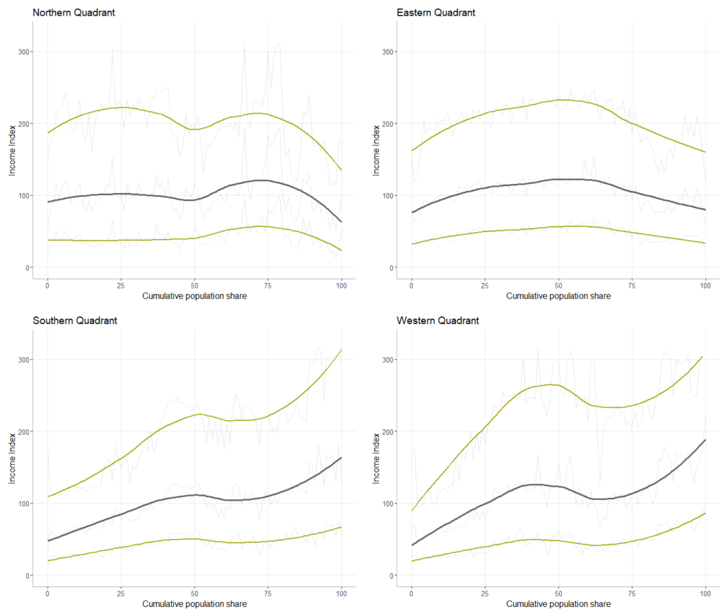
- Income over distance. We reproduce the method used to relate income and density for distance from the city center. Instead of ranking neighborhoods by density, we ranked them by distance from the city center. We then calculate the cumulative population by distance to normalize the relationship and increase comparability, especially between cities of different size. In addition to relating income to distance, we assess the relationship by cardinal direction. Many cities have a distinct pattern of directionality. That is, lower income and higher income neighborhoods are not only segregated, but they also tend to cluster in different directions of the city. In the polar diagram above, it is clear that neighborhoods to the west and south east of Los Angeles are higher income than those in the center and to the northeast. To capture some of this variation, we produce income over distance graphs for the main cardinal directions. The heavy gray line is the smoothed median income over distance and the yellow lines are the bottom and top quintile. The light gray lines show the variation without smoothing. That is it shows the income level at each percentile of the cumulative population by distance.
LIST OF CITIES INCLUDED
AUSTRALIA
- Adelaide
- Brisbane
- Gold Coast
- Melbourne
- Perth
- Sydney
BRAZIL
- Aracaju
- Belém
- Belo Horizonte
- Campinas
- Campo Grande
- Caxias do Sul
- Ceilândia
- Cuiabá
- Curitiba
- Feira de Santana
- Florianópolis
- Fortaleza
- Gama
- Goiâna
- João Pessoa
- Joinville
- Juiz de Fora
- Londrina
- Macapá
- Maceió
- Manaus
- Maringa
- Natal
- Novo Hamburgo
- Porto Alegre
- Recife
- Ribeirao Preto
- Rio de Janeiro
BRAZIL
- Salvador
- Santos
- Sao Goncalo
- São José do Rio Preto
- São Jose dos Campos
- São Luís
- São Paulo
- Sorocaba
- Teresina
- Uberlândia
- Vila Velha
CANADA
- Calgary
- Edmonton
- Montreal
- Ottawa
- Toronto
- Vancouver
- Winnipeg
FRANCE
- Bordeaux
- Grenoble
- Lille
- Lyon
- Marseille
- Montpellier
- Nantes
- Nice
- Paris
- Rennes
- Rouen
- Saint-Etienne
- Strasbourg
- Toulon
- Toulouse
SOUTH AFRICA
- Cape Town
- eThekwini
- Johannesburg
- Nelson Mandela Bay
- Tshwane
UNITED STATES
- Akron
- Albany
- Albuquerque
- Atlanta
- Austin
- Baltimore
- Baton Rouge
- Birmingham
- Boston
- Buffalo
- Charleston
- Charlotte
- Chicago
- Cincinnati
- Cleveland
- Colorado Springs
- Columbia
- Columbus
- Dallas
- Dayton
- Denver
- Des Moines
- Detroit
- El Paso
- Fort Worth
- Fresno
- Grand Rapids
- Harrisburg
- Houston
UNITED STATES
- Indianapolis
- Jacksonville
- Kansas City
- Las Vegas
- Los Angeles
- Louisville
- Madison
- Mcallen
- Memphis
- Miami
- Milwaukee
- Minneapolis
- Nashville
- New Orleans
- New York
- Norfolk
- Oklahoma city
- Omaha
- Orlando
- Philadelphia
- Phoenix
- Pittsburgh
- Portland
- Providence
- Raleigh
- Richmond
- Sacramento
- Saint Louis
- Salt Lake City
- San Antonio
- San Diego
- San Francisco
- Seattle
- Tampa
- Toledo
- Tucson
- Tulsa
- Washington D.C.
- Wichita